
Figma, Adobe XD, Miro
Wireframes, Prototypes, Brand Development, User Research & Product Design
Music streaming has shifted listening from an immersive experience to passive consumption, with platforms prioritizing convenience over intentional engagement. This change weakens the connection between artists and listeners. Vityl aims to restore this by promoting intentional and customizable music interaction.
As we move forward each day, we often bloat ourselves with overconsumption. Whether it be internet videos, Netflix shows, others' opinions, news, or music, this overconsumption has pushed us to lose control and sight of why we began these things in the first place. I sought to create a solution to this; to focus on bringing intention back to the listening experience. With a focus on artistry and new interaction, Vityl looks to innovate and repair enjoyable listening through a blend of shifted focuses, interactions, and features.

With the goal of intention, I looked for innovative ways to change the way the user interacted with the body of work. The artist set out with an proposed setlist. Crafting each song into the next to develop strong motifs and story for the listener, carefully stitching each song together to convey what they are trying to say. With the inspiration of the user journey previous media forms offered, Vityl looks to empower the user to customize their listening experience through new solutions and approaches to albums.
To root the idea of past media, the Vinyl Deck is the main way to interact with music. Using rotation controllers to interact with the now playing. Also setting aside the album art in Collections Carousel. This is to give each album a place within your catalog. Once, the album is selected, our simplistic UI layout begins to tailor to the artwork and colors of the selected album.
To also give the user the ability to tailor their own listening experience, you can press your own records into Playlists. This functions allows crossfading between each song and customization of album artwork. This enables users to build their own forms of storytelling and combinations to compile and share.

To better understand my audience, I created a series of user personas to reflect the problems of the audience I am designing for. By understanding their userflows and pain points, I began to build purposeful designs while laying out my application wireframes.


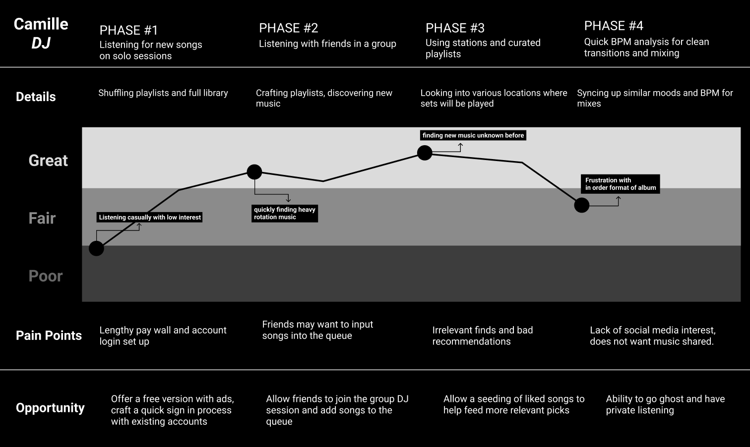
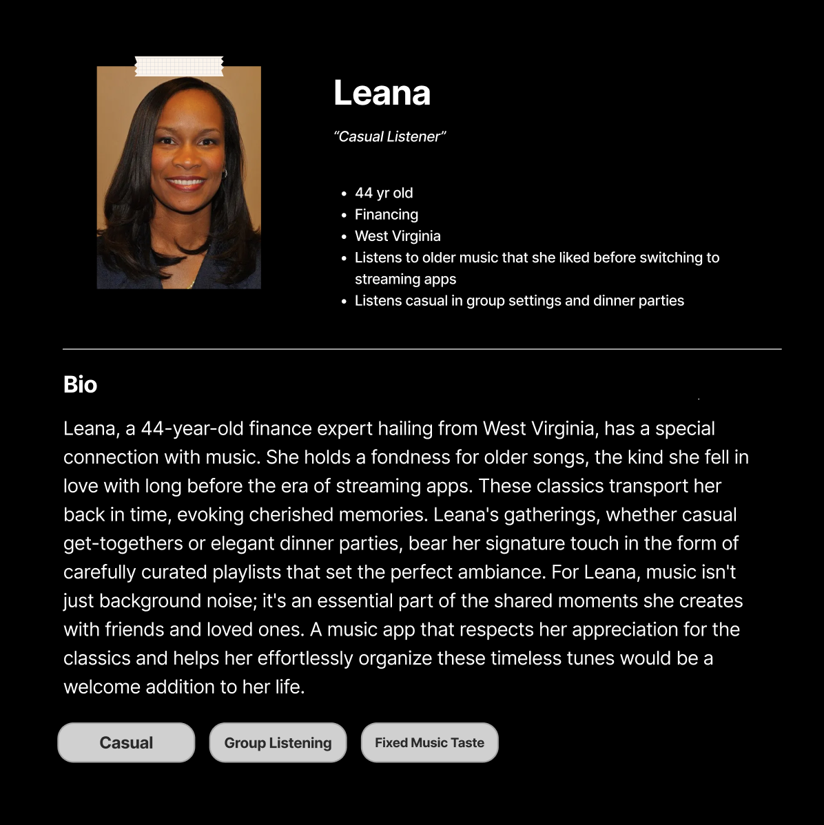

Through case study and student collaboration I looked to get a true picture of how music listeners used apps and what they where looking for. These are developed user personas and the qualities users expected for the usage of this media app. This allowed me to begin to get a real view of what motivated user journeys and pain points for user flows and wireframes.


As we move forward each day, we often bloat ourselves with overconsumption. Whether it be internet videos, Netflix shows, others' opinions, news, or music, this overconsumption has pushed us to lose control and sight of why we began these things in the first place. I sought to create a solution to this; to focus on bringing intention back to the listening experience. With a focus on artistry and new interaction, Vityl looks to innovate and repair enjoyable listening through a blend of shifted focuses, interactions, and features.


From this basis of user journeys and research it became helpful to begin laying out a flow to understand the way screens would function and play into each other.
To begin fleshing out what this app would look and function like, I focused on developing a simplistic system of icons and typography that could be carried out to keep a consistent and enjoyable user experience. Due to multidisciplinary background, I was able to begin successfully creating a brand and visual language to succeed in this goal. Below are the developed assets and applications viewed in the prototype demo.


Following the implementation of these working prototypes, I conducted user testing and interviews to assess their effectiveness. Through this process, I identified which design decisions were successful and which needed refinement. Too much content on certain pages and missing features on others became much clearer when evaluating their paths. As users interacted with the screens, I gained insight into pain points and areas where my initial iterations fell short. Analyzing feedback allowed me to recognize patterns, prioritize necessary changes, and iterate toward a more intuitive and seamless experience.
Examples and refinements of these the needed additional features were implemented: on boarding, lyrics, and information architecture & text contrast issues.


Using research-backed interactions and insights from user testing,I moved towards finalizing my prototype in Figma. This phase was crucial in translating findings from usability studies into intuitive design solutions, ensuring that user pain points were addressed effectively. Interactive elements, animations, and microinteractions were incorporated to enhance the overall user experience. Through iterative testing and feedback loops, the final product took shape, bringing together design, functionality, and user-centered principles into a polished and cohesive interface.


After my first self-led UX case study, I gained valuable insights throughout the process. Here are some key takeaways and areas I would approach differently next time:
1. Embrace Iteration – Design doesn’t have to be perfect on the first attempt. UX is an iterative process, and each “failure” is actually a step closer to an effective solution.
2. Design for the User, Not Yourself – Personal biases can lead to misleading and ineffective designs. The most impactful solutions come from immersing yourself in the users' perspectives and setting aside assumptions. While this was challenging, it was also one of the most rewarding aspects of the process.
3. Prioritize Research – While clean aesthetics are important, strong design decisions must be backed by thorough research. If I were to do this again, I would dedicate more time to user testing and interviews to ensure the app is not only visually appealing but also truly usable, accessible, and effective.
